The Six-Month Room
Unexpected red theory went from one TikTok to a Sotheby's sponsorship in four months. Half the furniture we throw away isn't broken. A look at what the churn actually costs.
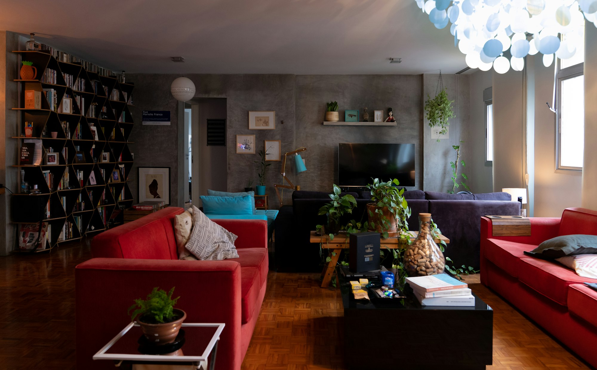
On 17 January 2024, a creator called Taylor Simon posted a video to TikTok under the handle @intayriors. The idea was simple enough to explain in a sentence: add "anything that's red, big or small, to a room where it doesn't match at all — and it automatically looks better." She called it unexpected red theory.
Seventeen days later, Apartment Therapy published an explainer. Within four and a half months, Simon was making a sponsored video with Sotheby's, tied to two June auctions.
Seventeen days from a bedroom in front of a phone to an auction house's marketing department. That is the speed at which a home trend now travels, and it is worth sitting with, because five months later Zillow surveyed more than 4,200 home buyers about interior colour and found that a living room painted fire-hydrant red was associated with a willingness to pay $1,820 lower than the alternatives. It was the worst-performing colour they tested.
Everywhere on your phone. Value-destroying at the front door.
The cycle really has compressed. Here is the proof.
It is easy to assert that everything moves faster now and hard to show it. So here is the cleanest comparison I could find.
Cluttercore emerged in August 2021, when an explainer from the creator @4walls took off. Apartment Therapy published its version in May 2022 — a lag of nine months from origin to mainstream shelter-title coverage.
Two and a half years later, unexpected red theory covered the same distance in seventeen days.
Same platform. Same publication, even. Roughly a twentyfold acceleration in the time it takes an idea to go from one person's front room to the trend pages.
The outer bound is the mob wife aesthetic, which is properly a fashion look that leaked into interiors — leopard, gilt, heavy drapery. A New York creator called Kayla Trivieri posted the catalyst video on 6 January 2024. The hashtag passed 100 million views within a few weeks. By spring it was finished. Nowhere to everywhere to over, inside a single quarter.
Trivieri's own verdict is more grounded than most of the commentary about her: "Trends are just supposed to be fun. We lose sight of those things in overanalyzing trends."
The homogenisation argument, made at length.
The instant retrospective
There is a stranger symptom of the speed, and once you see it you cannot unsee it.
Coastal grandmother was coined by Lex Nicoleta in March 2022 — the Nancy Meyers kitchen, linen, a lemon in a bowl. By 30 June 2022, roughly three months later, Nicoleta had posted a "coastal gran origin story" video.
Three months in, and the trend was already being narrated as history by the person who started it. The nostalgia arrived before the thing was over.
Her description of what she was actually going for is disarming, and it is not really about sofas: "a marriage of everything that I am and everything that I want to be: fresh flowers in the living room, making coffee in the morning, listening to cozy music." The point, she said, is "romanticizing your own life."
That is a reasonable thing to want. It is also, industrially speaking, an extremely useful thing to want.
Who decides what colour the year is
Above the creators sits a slower and much older machine: the colour of the year.
Pantone, Dulux, Benjamin Moore and others each announce one, months ahead, with a narrative attached. The obvious question is whether any of it actually predicts, or shifts, what people buy.
The best available answer is a 2021 paper in Color Research & Application, which analysed 99 colour-of-the-year picks across 15 firms from 2011 to 2020. It found the choices were not especially bold — median chromaticness of only 20% — and that they cycle: roughly an eight-year cycle in lightness and a four-and-a-half-year cycle in chroma. The authors were candid that they could not verify predictive accuracy at all.
An eight-year cycle. Meanwhile the discourse it feeds moves in weeks.
One executive has said the quiet part out loud. Lisa Kudukis of Dunn-Edwards, on their own colour of the year: "It's not going to change the trajectory of our company… It is a conversation starter."
Worth noting that Farrow & Ball does not name a colour of the year at all — its 2026 flagship campaign is instead built around rooms people already have. A paint company declining the single most reliable piece of free press in the sector is a choice, and an interesting one.
A sceptical read of the colour-of-the-year announcement.
The sad beige comedy
The best illustration of how circular this is arrived over the last eighteen months.
"Sad beige" began as satire — Hayley DeRoche, posting as @sadbeige, narrating muted children's products in a Werner Herzog voice. It was a joke about a particular kind of tasteful, drained, photographable minimalism.
In January 2025, Pinterest's UK head of home, Matt Siberry, declared it finished: "This year marks a shift as more people move away from minimalist 'sad beige' interiors in favour of bold, joyful designs." In April 2026, Homes & Gardens ran "The Sad Beige Era Might Be Over", with designers nominating cola brown, soft mauve, butter yellow, muted green and muddy pink as the replacements.
Then the colour houses announced their 2026 picks. Pantone chose a white. Benjamin Moore chose an espresso brown.
Beige was declared dead and immediately succeeded by its two nearest neighbours.
What the churn actually costs
This is where a trend piece usually stops. It shouldn't, because the numbers are extraordinary and almost nobody puts them next to the aesthetics.
The US Environmental Protection Agency has tracked furniture and furnishings in municipal solid waste since 1960. The series runs from 2.15 million tons in 1960 to 12.08 million tons in 2018 — a 5.6-fold increase against a population that did not quite double. Per head, it roughly tripled.
But the number that states this article's thesis outright comes from WRAP, the UK waste body, which assessed what is actually in the furniture waste stream. It found that around 45% of furniture collected at the kerbside, and just under 50% at recycling centres, was reusable as-is or with slight repair.
Read that again. Roughly half of the furniture being thrown away is not broken.
It is out of favour. That is a different thing, and it is a decision rather than a failure.
On what has happened to how furniture is made.
Brown furniture, and the eight years nobody wanted it
Here is my favourite thing in the research, because it is the whole argument compressed into one object.
For 48 years, from 1968 until he stopped in 2017 at the age of 80, a man called John Andrews compiled the Antique Furniture Price Index. By 2016 it recorded that prices for standard English antique furniture had fallen for the eighth successive year. Solid, repairable, century-old pieces — mahogany chests, oak tables — were worth less every single year for the better part of a decade.
Now look at 2026. The marketplace 1stDibs surveyed 468 interior designers and found chocolate brown the top colour choice for 2026 at 33%, with 63% planning to source antiques, up from 56% in 2024. Benjamin Moore's espresso pick explicitly cites "renewed interest in the brown colour family."
The material that was falling in value for eight consecutive years is the material the industry is now selling as new.
Nothing about the objects changed. Only what we agreed they were worth.
So what actually lasts?
The honest answer is that the durable choice and the photogenic choice are measurably different, and we have a number for it.
That Zillow study — 4,200 buyers, shown randomly assigned images, asked what they would pay — found premiums for charcoal grey in a living room (+$2,593), navy in a bedroom (+$1,815) and olive green in a kitchen (+$1,597). And penalties for daisy yellow in a kitchen (−$3,915) and fire-hydrant red almost anywhere.
Its most quietly subversive finding: darker shades of green, blue and grey outperformed white. Which contradicts the estate agent's standard advice to paint everything white before a viewing, and also contradicts Pantone's white pick for 2026.
Two caveats, since this is the piece's key number. It is a survey of stated preference, not transaction data — it measures what buyers say. And it is Zillow's own research, published by Zillow.
Is "timeless" just another trend?
I put that question to the record, and the designers do not agree with each other, which is the most interesting possible outcome.
The sharpest sceptical line comes from Bethany Adams:
What we think of as 'timeless' actually refers to styles that have simply come back into vogue. — Bethany Adams
Katie Kiser calls timelessness a "false sense of security that makes us think we will never want to tweak an interior." Kailee Blalock: "Everything will date eventually if it's treated like a formula."
Against them, Marie Flanigan: "Timelessness isn't a lie, but it is often misdefined" — and, more usefully, "everything will inevitably reflect the era in which it was created." Jennifer Davis puts the constructive version best: it is "about proportion, restraint, and respect for classic forms."
One caveat I owe you. Almost everyone quoted advocating slowness sells bespoke, expensive, slow work. Lizzie Deshayes of Fromental — "We want things that will last for 50 years or more" — makes hand-painted wallpaper. "Buy less, buy better" is good advice and it is also a sales pitch, and it can be both at once.
The useful conclusion
Trends do not last. That is not a flaw in them; it is the definition. The question worth asking is not whether a thing will date but how expensive it will be when it does.
A cushion in this year's colour is a cheap way to be current. A whole room is not. The compression is only a problem where it meets things that are costly to undo — a kitchen, a bathroom, a floor, a sofa you cannot lift alone. Those are the decisions worth making slowly and, on the only buyer evidence available, worth making darker and quieter than the internet suggests.
And if you already own something solid and brown that fell out of fashion for eight years, the industry would now like to sell you one. You could simply keep yours.
A note on the sourcing
Trend dates here are anchored to primary artefacts — the actual post that coined a term, and the publication date of the first mainstream explainer — rather than to search-volume data, which could not be obtained. That is coverage data, not demand data, and the distinction matters.
Hashtag view counts are quoted as recorded by the publications that reported them, on different dates, and TikTok has since changed how it surfaces those figures. They should not be read as a like-for-like series. The 1stDibs and Zillow figures are company research on their own markets. And Ireland's EPA reports 408,004 tonnes of bulky household waste for 2024, but does not break furniture out of that total, so we have not claimed it as a furniture figure.
Videos are shown via YouTube's official embed and remain the property of their creators.
You Might Also Like
The latest from The Moiré Edit.